
Process Documentation
Research
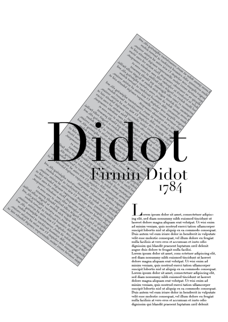
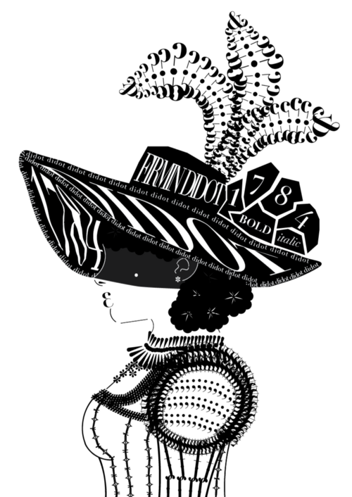
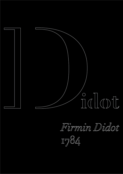
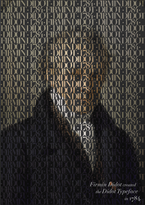
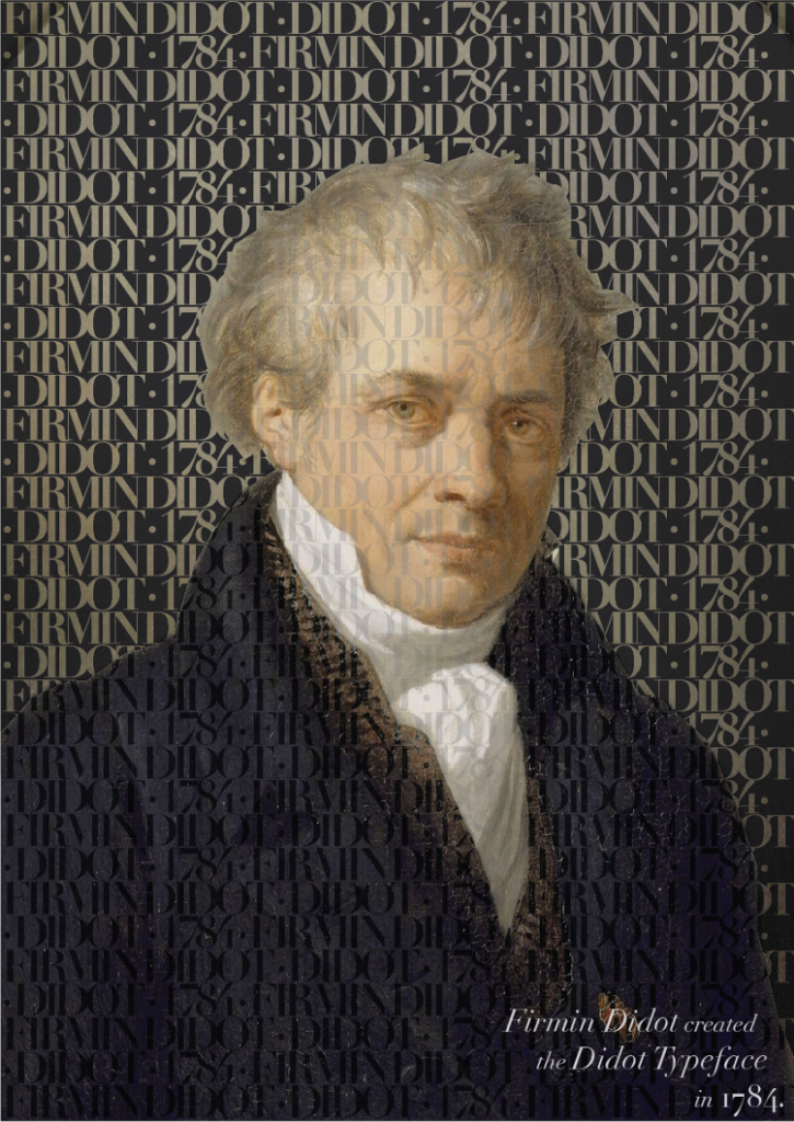
Designer- Firmin Didot, later Adrian Frutiger
Year- 1784, 1991
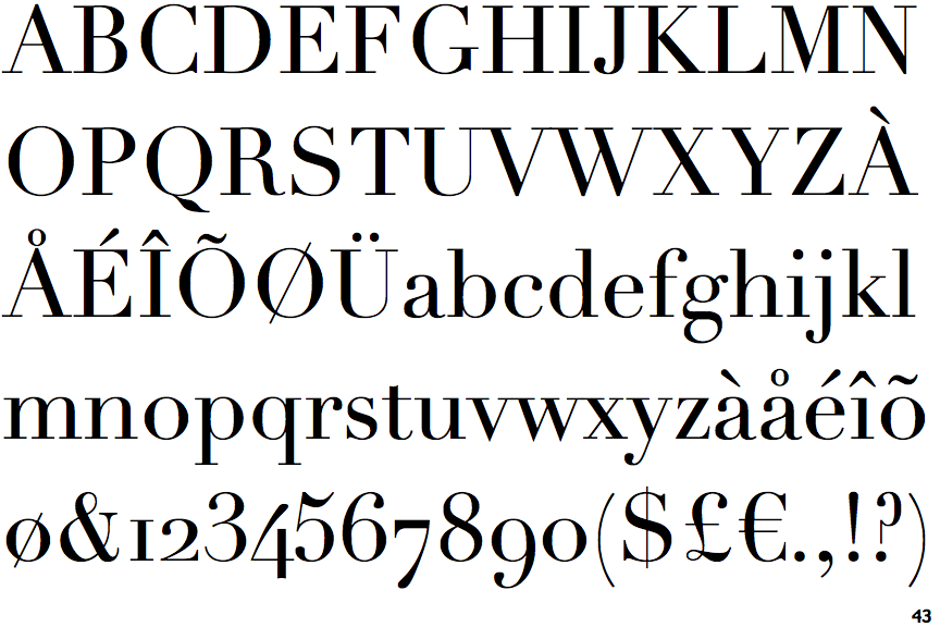
Identifiable characters- a f g J Q & ! ?, all letters to some extent
Possible Quote -Je dois peut-etre demander excuse a ce public d’abvoir laisse acte V, scene 5, un vers qui s’est presente naturellement à mon esprit:
Inès excitera la Pitié, la Terreur.
Et qui m’a fait trembler quand ma plume l’ecrivit, parce qu’il indiquait precisement les deux passions que l’ancien legislateur de la poetique, Aristotle, demands a la Tragedie d’exciter dans notre ame. — Firmin Didot
English: I may have to apologize to this audience for letting go of act V, scene 5, a verse that naturally came to my mind:
Ines will excite pity, terror.
And that made me tremble when my pen wrote it because it indicated precisely the two passions that the old legislator of poetics, Aristotle, asked the tragedy to excite in our souls.— Firmin Didot
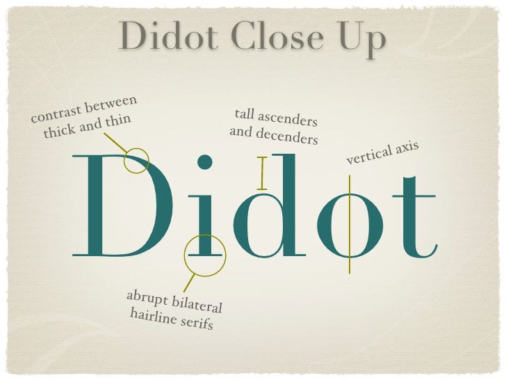
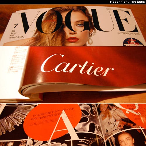
- Commonly used in fashion magazines and premium brands (didone variation)
- One of the first modern serif typefaces
- Originally developed for stereotype printing
Resources:
https://www.typography.com/fonts/didot/history/
https://www.linotype.com/171/linotype-didot.html
https://www.linotype.com/370/firmin-didot.html
https://ilovetypography.com/2008/05/30/a-brief-history-of-type-part-4/
http://printingcode.runemadsen.com/lecture-typography/
https://www.behance.net/gallery/7657505/Through-Thick-Thin-Didot
https://www.typography.com/fonts/didot/overview/
https://designroast.org/font-series-didot/
Preliminary Stages
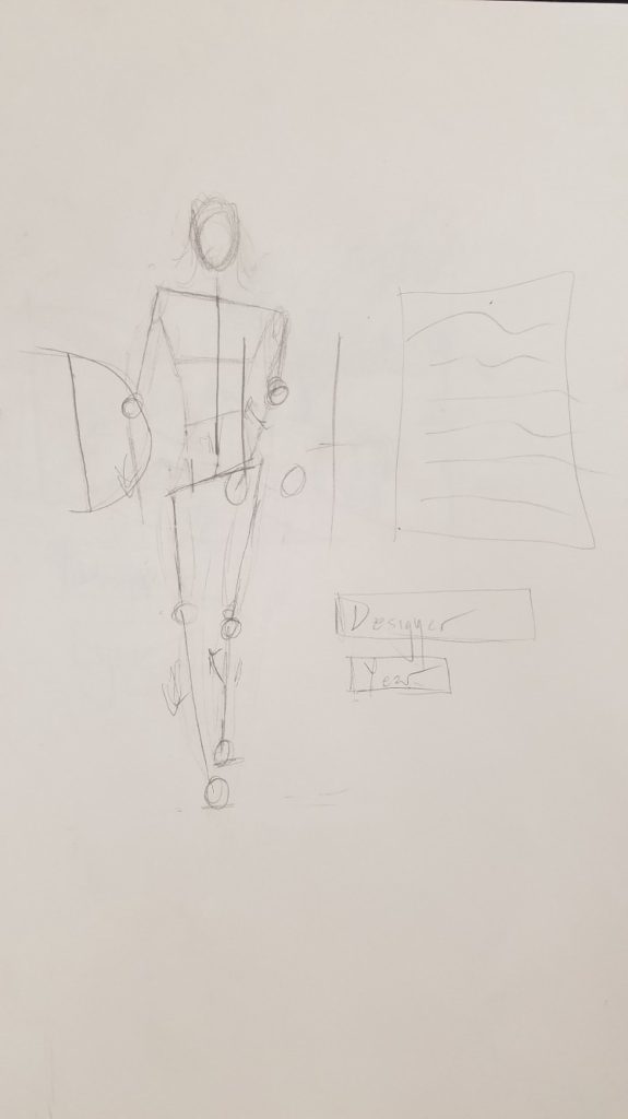
After researching the contemporary and historical uses of the font, I generated several ideas that took these aspects into account.
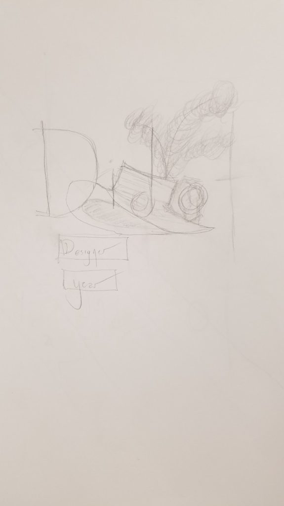
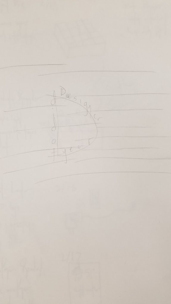
I sorted through my initial sketches and decided to do the first and third sketches digitally.
I then decided I disliked the first option and decided to continue with the second option and combine it with my second initial idea. I also explored several other avenues.

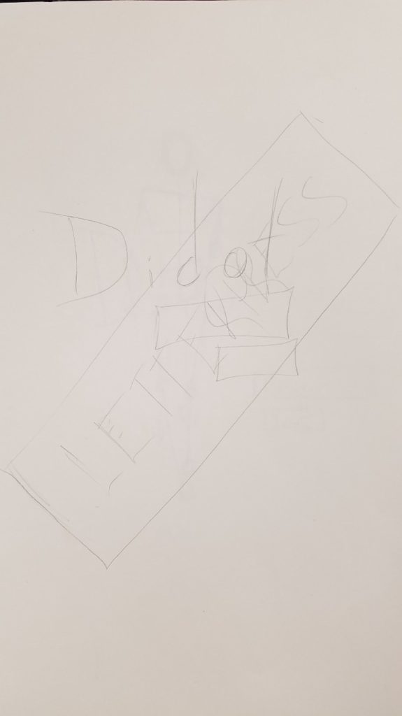
I iterated further on my first and third options and decided that I preferred the first option and that combined the modern and historical contexts better.
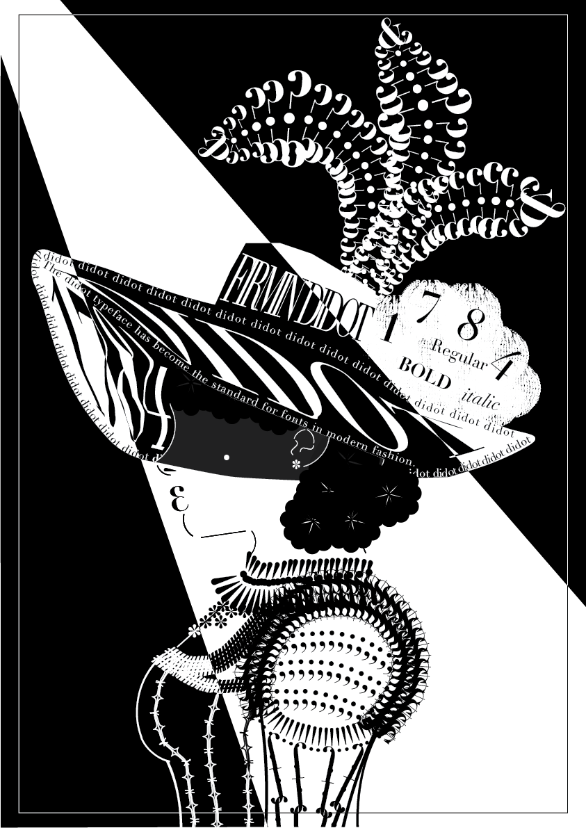
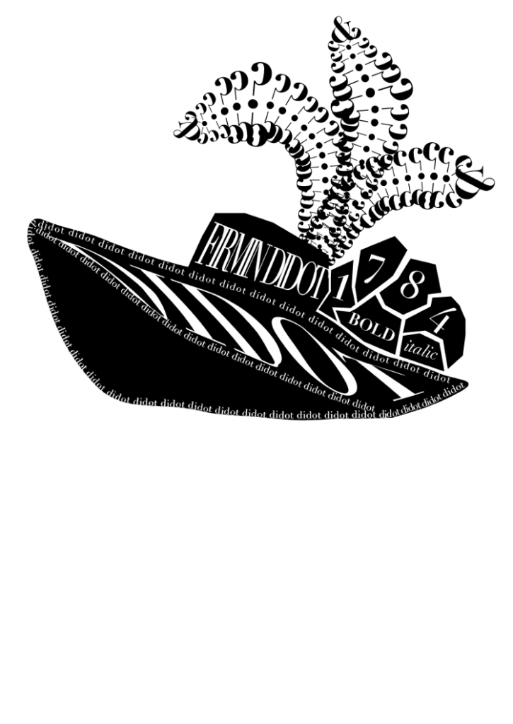
Upon receiving feedback, I changed some of the text on the hat in order to explain some of the relevance of the image to the font. I chose this particular piece because I feel it demonstrates the historical and aesthetic aspects of the font well. The style of clothing is inspired by later 1700s French fashion, and ties together the historic and fashion connotation of the font. Additionally, the piece is done almost entirely utilizing the font in order to construct the image, showcasing different characters of the font and their characteristics.