Process Documentation
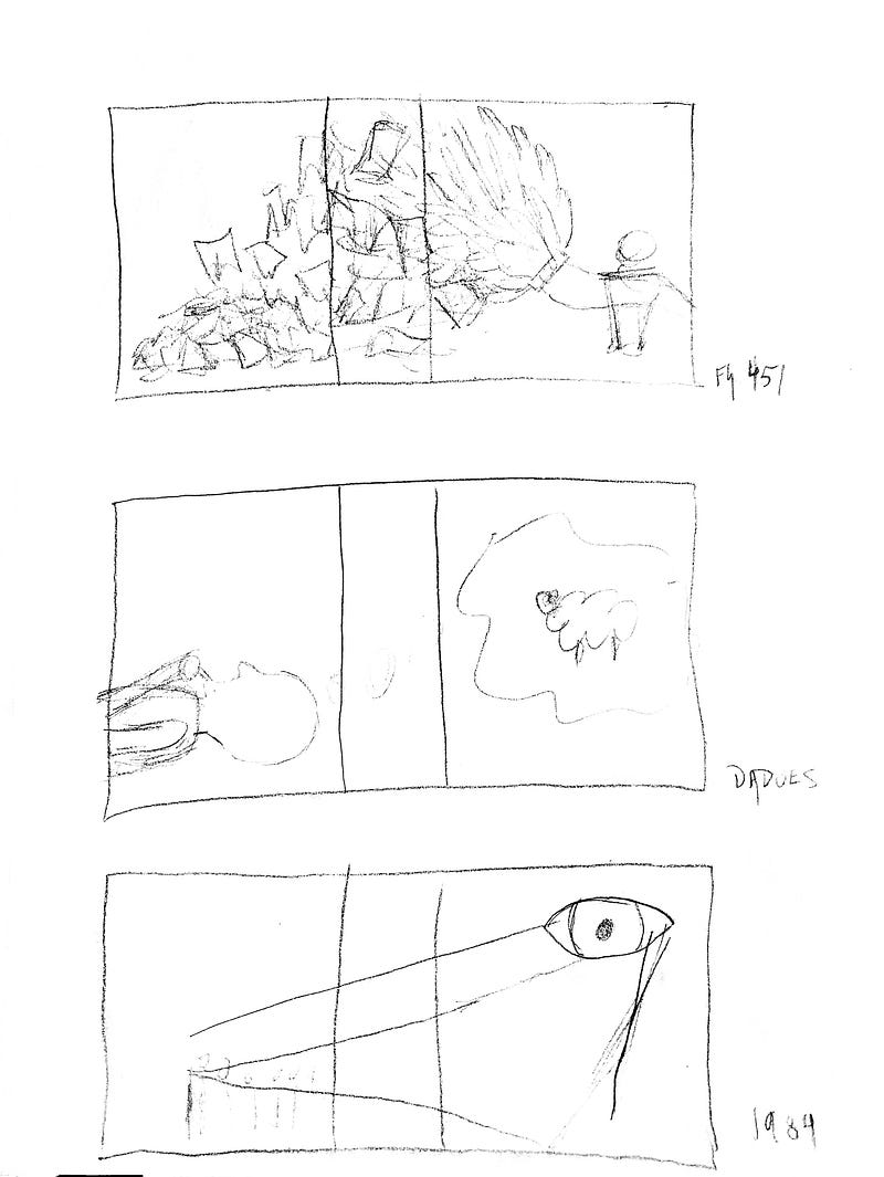
For the original sketches I tried to roughly outline the ideas and concepts I was going to explore in later digital iterations.
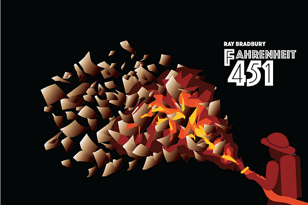
For the initial digital iterations I knew the layouts and themes I wanted to convey. I decided to make a color palette and use it for similar themes across the covers. I used red tones for things that would be considered antagonistic, and blue tones for this things that could be considered morally grey or good. I chose the Phosphate font family because I felt it conveyed an 1950s style view of a modern age; dated yet futuristic. As all these books are older dystopian novels, I felt as though this concept was in line with the cultural contexts of the books.
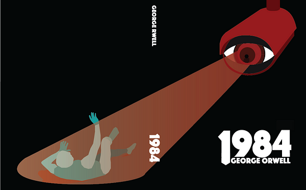
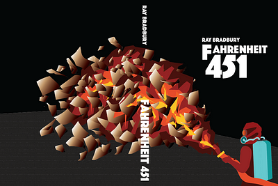
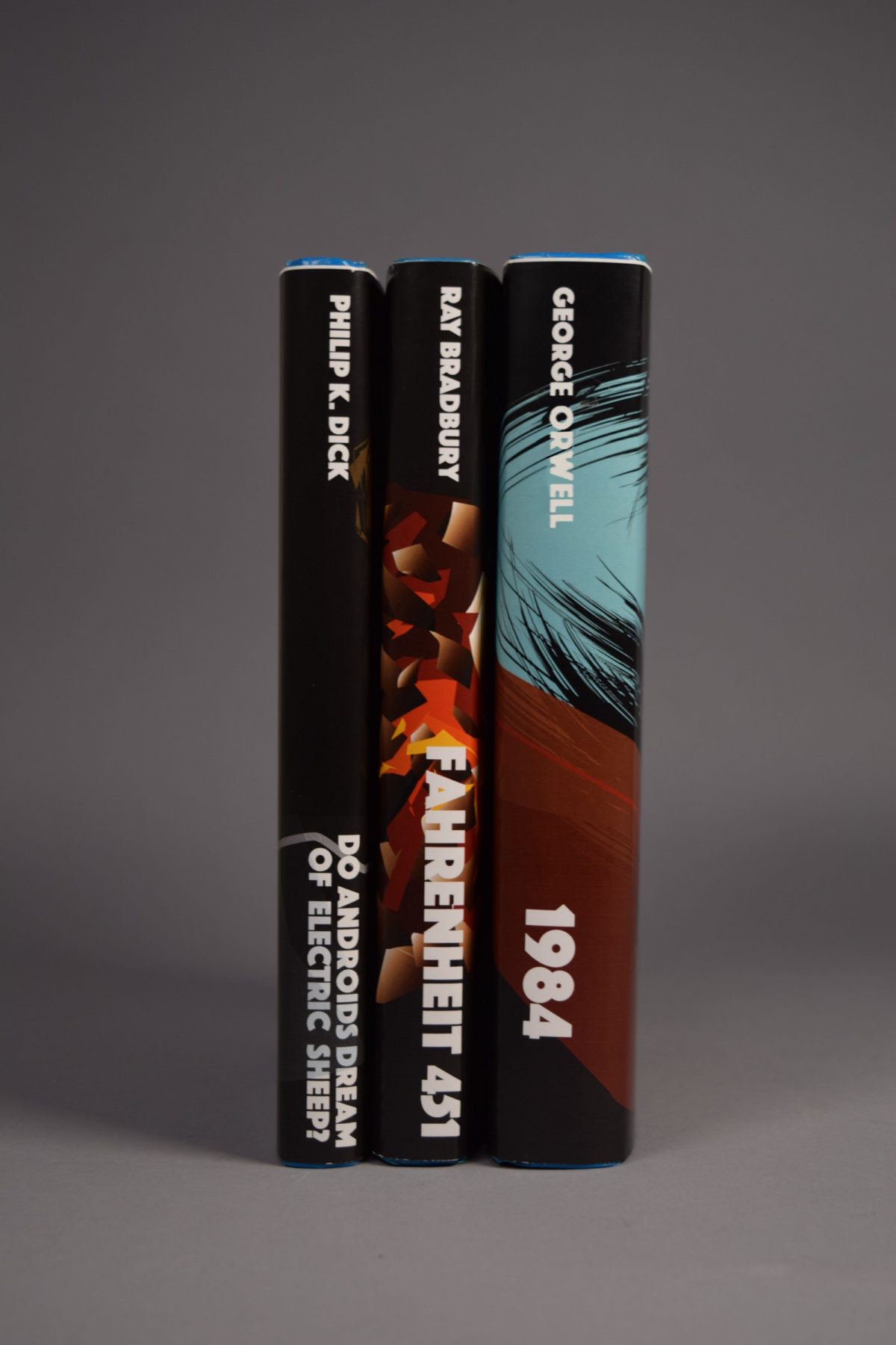
After the interim crit, I decided that I liked the style of the Fahrenheit 451 cover best and redid my other covers in the same fashion. I also brightened the colors in my palette so that they would not blend into the background when printed. I also started to standardize the font style across all the covers. I felt as though the 1984 cover was thematically and visually disjoint, so I redid it to focus on singular figures like in the Fahrenheit 451 cover. I also scrapped my original DADOES cover idea and began a new one. I decided that a flat black background was a good common base for all of the covers and integrated that. I also added the spine informative text as I hadn’t placed if for the first iterations.
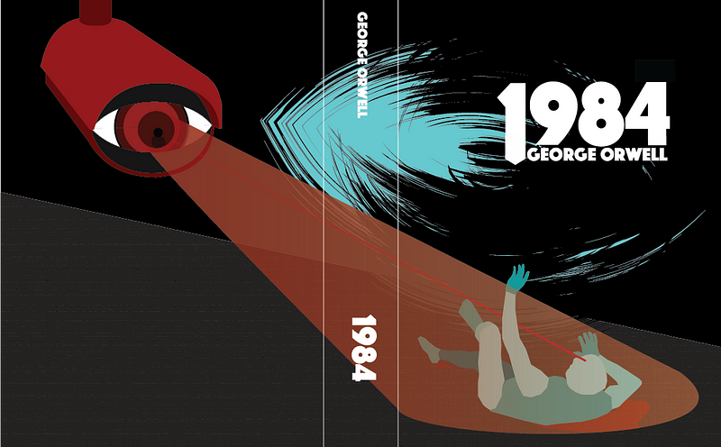
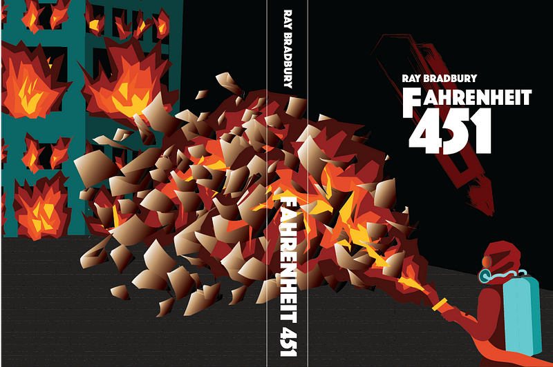
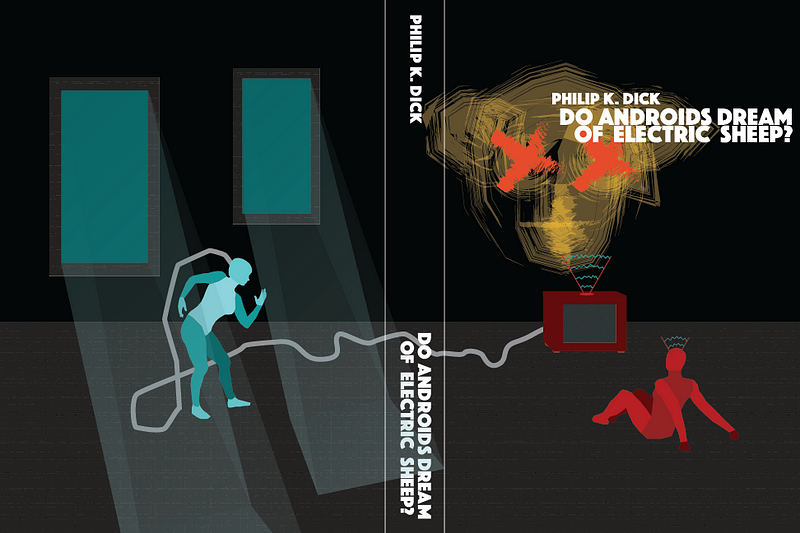
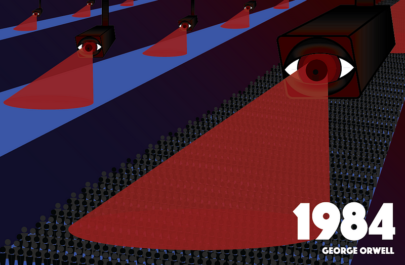
For the final iterations I decided to switch the direction of the camera-man illustration on order to follow the concept of tension and reveal better. I played with placing informative text on the backs of the covers but I ultimately decided against it as I felt it detracted from the composition of the illustrations. I standardized the locations of the titles and the alignments of the text down the spine. Each cover portrays antagonistic figures in red tones and neutral or good objects and figures in blue tones.
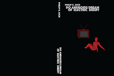
I also added a smear type figure in the background of the covers of each of the the books. The blue shape in 1984 is an graffiti eye; a warning. The pen in 1984 represents the resistance and those who continue to read and write. The electric sheep in DADOES represents the mindless consumption of luxury items for the sake of public image. Each of these concepts is central to their corresponding books.