Process Documentation
We initially interacted with an existing first aid kit and developed a list of pain points that we wanted to address. From there, we began developing solutions for those pain points as well as brainstorm new features we would like to include. We decided on a college demographic as our target market and collected statistics and conducted surveys to better understand our users.


First Prototype


Our initial design was in a cabinet style, but we found that storage and transport with this design was too tedious and complex. This prototype had these features:
●Cabinet-like opening
●Easy-to-read instructions on left-opening flap
●Band-aid dispenser on right-opening flap
●Color-blocked compartments
Second Prototype


Our second prototype swapped the cabinet-like lid for a fold-over lid. We reassessed our features, and developed solutions for them as seen below.
One-handed use?
●Velcro closure
Couldn’t see stock levels.
●Not using enclosed compartment dispensers
Contents on opening-flaps was too heavy.
●Remove band-aid dispenser
Band-aid dispenser was deemed not useful.
●Gauze more useful than band-aids – incorporate gauze dispenser
Third Prototype


After the second iteration, we determined that the partitions were too restrictive, and instead opted for a half partition.
We added the following features:
●Name tag
●Color blocking
●More targeted selection of items
●Clear instructions
●Compactness
●Glow in the dark night strips to find easily
We also decided to switch the fold out manual with a symbol and color coded manual that was more simplistic.


After completing our third prototype, we went out to the freshmen dorm called Donner and had two people in living in the dorms thoroughly think aloud with our prototype.
This process validated assumptions we made about the user based on our domain research, and also helped us tremendously in redesigning for the final prototype. Overall, the user feedback was positive, but there were several issues that we addressing in the final.
A few of the issues highlighted were:
●Band-aid dispenser and pull tabs were too extravagant for easy use ●More clear color blocking
●The manual did not fold out intuitively and was not universally designed for left-handed people
●The manual said only “burn cream” when we should have made it clear that it was “Neosporin”
●Also needed to add covers to the scissors and tweezer
We used this feedback to produce a new, more streamlined model that addressed the problems we had with the third.
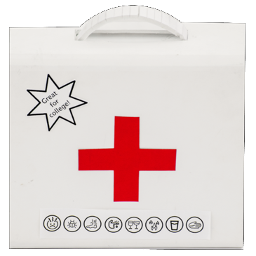
Final Prototype
Organizing the kit was one of the primary importance for us. Based on all the feedback from users, we decided to make a kit that uses the space more efficiently. The final prototype is of the same size of the kit that we started with but it is more organized. We also added an array of features discussed on the final prototype overview on the previous page.